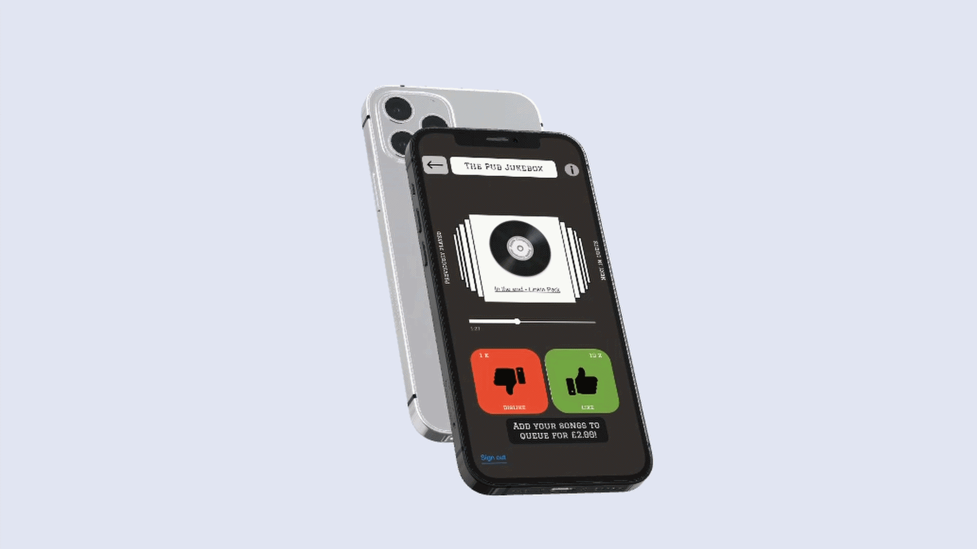

Project Summary
A project where I worked in a team of 7 to design an interactive listening experience between a jukebox mobile app and a smart TV app. At the end of the research, we discovered that the mobile app needed improvements such as more error prevention and recovery measures. Overall, participants found the micro-payment features easy to use and learn.

The Problem
▪️ People don't know how to recreate the Jukebox listening experience with modern technologies like smartphones.
Target Audience
▪️ A listening experience for music lovers of the Gen Z to Gen X era
▪️ The jukebox listening experience targets people between the ages of 18 - 65 years old. Maybe someone--like you. ;)
▪️ It is designed for people who visit public locations like bars, gyms, offices and cafes.
▪️ We also considered system moderators as target users as they would authorise access to the system if it locks.
My Role
▪️ I was the UI designer, interaction designer, video director, and video editor
▪️ All the teammates shared similar responsibilities like wireframing, information architecture and user interface design.
▪️ However, due to my competence with the FIGMA tool, we decided that I should be fully responsible for the creation of high-fidelity wireframes and testable prototypes for the mobile and TV interface.
▪️ I also used the DAVINCI RESOLVE tool to edit the video presentation. Below is a screenshot of my editing process.
Mandate: We completed 3 iterations in 3 months
▪️ We followed the lean UX process in completing every iteration.
▪️ Below is a graphical representation of the lean UX phases and iterative process
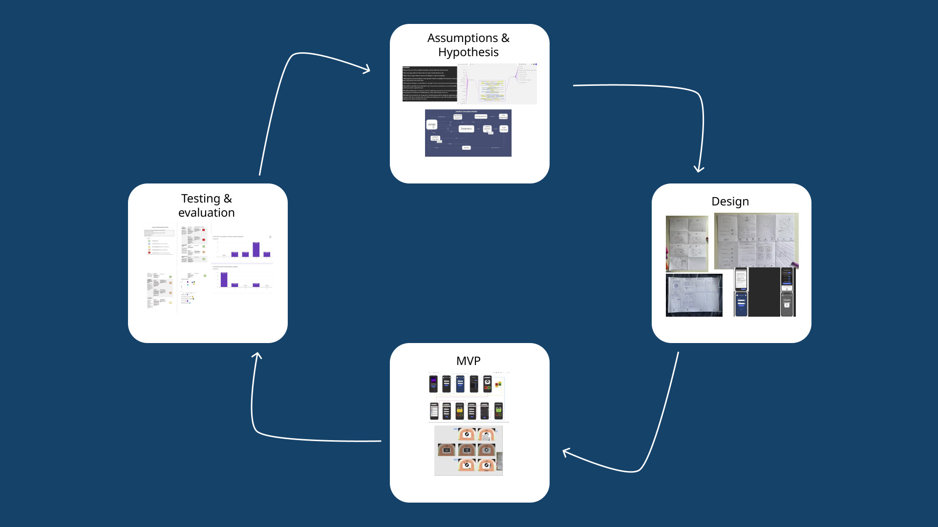
Representation of the Lean UX phases and iterative process
Assumptions and Hypothesis Phase:
▪️ We conducted brainstorming sessions to come up with solutions to the following design challenges:
+ How we could make the system appropriate for offices, gyms, bars, etc.
+ How we would design the system to manage the songs by being played by people who are making micropayments.
+ How to make the system manage user preferences.
▪️ Be honest, how would you have solved these challenges? With our super brain power, :D we came up with three assumption
▪️ First assumption to solve the design problem was that the TV interface should have similar aesthetics to the classic Jukebox
▪️ The second assumption was that a queue of upcoming songs be displayed so users can make better decisions regarding micropayments.
▪️ The third assumption was to ensure fairness in song selection, we proposed a pre-voting check. This will create an unbiased playlist with more highly-rated songs played.
Design Phase:
▪️ We constructed a conceptual model to represent how the listeners would interact with the system. A representation of the conceptual model is shown below
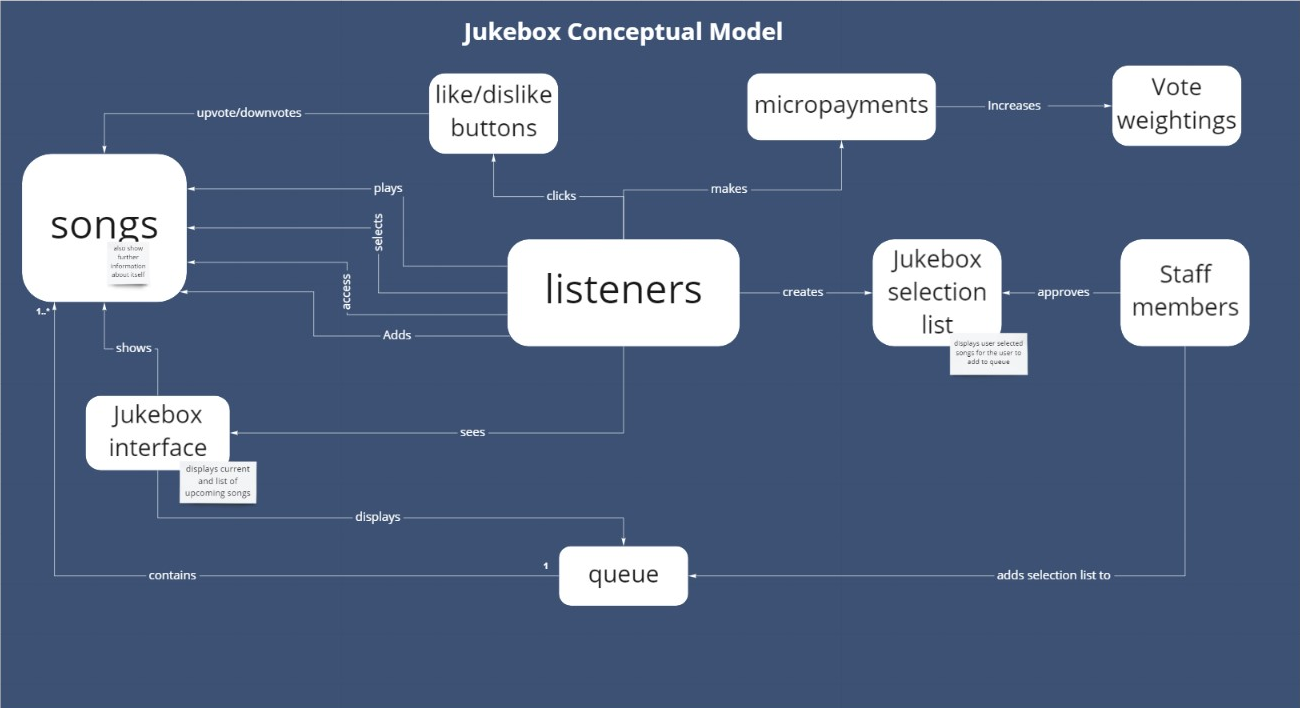
Representation of the Jukebox system conceptual model
▪️ We used the crazy 8s design technique to quickly create user interface ideas of how users would interact with different screens to complete tasks. the photos below are my sketch contributions for both device interfaces
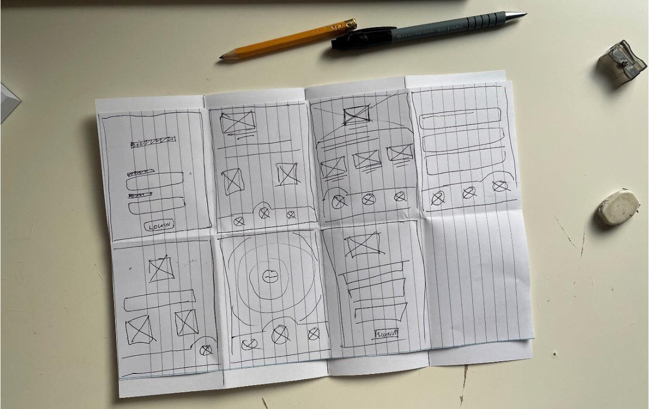
Mobile interface sketches
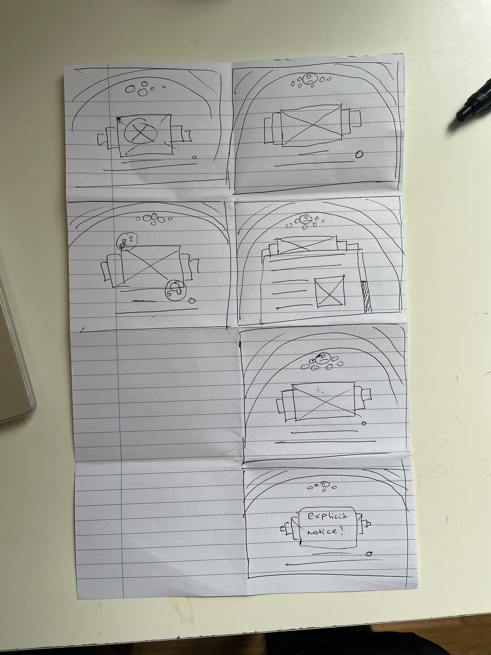
TV interface sketches
▪️ After deciding on the sketches for each device's user interface, we used 5 design principles to guide the curation of the high-fidelity wireframes.
▪️ The principles include:
+ Perceptual organization of information
+ Error prevention and recovery
+ Flexibility of use
+ Simple and Intuitive
+ Equitable use
▪️ Focusing on these principles ensured that the design was simple for a user to interact with. More justification for using the five design principles
▪️ We used MIRO to do collaborative pair design sessions during the creation of high-fidelity prototypes.
Minimum Viable Product (MVP) Phase
▪️ Smartphone Interface
+ Note: The prototype contains 6 flows each of different test scenarios
+ Flow 3 - The starting point of returning customer experience
+ Flow 4 - Testing the textbox clear scenario for the customer.
+ Flow 5 - Testing the textbox clear scenario for a staff member.
+ Flow 6 - Testing invalid input to log in for returning customers.
+ Flow 7 - Testing Voice commands
+ Flow 8 - Testing Textbox clear for Visa card details entry of adding new songs to queue.
▪️ Jukebox Smart TV
+ Note: this prototype contains two flows each of different test scenarios
+ Flow 1 - Testing song information button.
+ Flow 2 - Testing song vote feedback.
+ Flow 2 - Testing song vote feedback.
Testing and Evaluation Phase
▪️ We used two research methods to evaluate the usability of both devices. (Heuristic evaluation and System Usability Scale (SUS) questionnaire)
▪️ Heuristic evaluation method was tested with 4 participants from the Brunel computer science department and the SUS questionnaire was tested with different participants from the same computer science department.
▪️ We used GOOGLE FORMS to share the SUS questionnaires with the participants.
▪️ The heuristic evaluation showed that the mobile design needed heavy improvements in design consistency, error prevention measures, and it needed to reduce the user memory load. The photo below is a sample of the heuristic questionnaire results
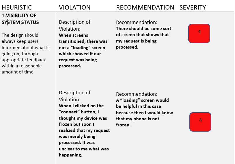
Sample of the heuristic questionnaire data results
▪️ The SUS questionnaire research results showed that the interaction experience between both devices was easy to learn and understand. The photo below is a sample of the SUS questionnaire data results.
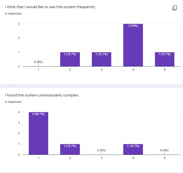
sample of the SUS questionnaire data results.
Reflections
▪️ We had successfully completed 3 iterations however the research on the devices lacks ecological validity as all participants share similar ages and backgrounds (due to the Brunel University project participant constraint).
▪️ The research results have low reliability because of the small sample size of 4-6 participants and the contradictory data results from both research methods
▪️ If I had more time to work on this project, I will do interview research on participants outside the university campus for realistic results. I will also curate open-ended questions that allow users to share their thoughts on the micropayment features.
▪️ I will also do a walk-through research on the mobile and smart TV interface usability. A usability tool, Maze will show results like click rate and bounce rate for reliable objective data to improve the user interfaces.


