
Final UI design sneak peek

Definition of Bushcraft
Bushcraft is essentially the skill used to live in harmony with the wilderness. Yeah, where there are no charging ports, sports bars and hair salons.
Project Summary
I created this magical web app to solve student engagement problems in the formal learning of bushcraft. The project lasted for 5 months and a few days. I was the UX/UI designer. I used Figma and Maze for making prototypes and testing, and I found the participants through social media. I also used a visual Gantt chart to help me keep everything organized.
I targeted the solution at UK adults and created Lofi and Hifi wireframes. I tested it using quantitative and qualitative research methods. The results showed that participants could recover from unwanted actions. The app's onboarding process was a helpful guide for navigating its features. Lastly, they expressed how the app consolidated knowledge and encouraged creative thinking.
Want to learn more about the project? Keep reading below.

The Problem
▪️ Literature articles show that there are limited UK government investments in practical learning in the formal learning approach, which discourages people from learning a diverse range of topics and practices in bushcraft.
▪️ And people are also discouraged from learning in a formal environment because of the fear of being perceived as passive learners.
▪️ Alternative wilderness learning approaches, like forest schools, focus on children which means there is an accessibility gap for adults.
Constraints
▪️ The time frame was 5 months and 12 days.
▪️ This was a university project. So, I was required to gain ethical approval from before conducting participant research.
▪️ There was no budget for usability tests.
Tools - Figma, Maze, and Google Forms
Target Audience
UK adults are the target of this innovation.
▪️ I chose UK adults (18 years and above) because there is an opportunity and a possible need for a tool to aid them in learning the skill that resources like forest schools and outdoor education do not cater to.
▪️ Specific adults like practitioners can use the app to support their teaching efforts by serving as a creative thinking tool for their students.
▪️ It can also be useful to adults that cannot attend practical bushcraft lessons due to terrible circumstances like illness, poor mental health and extreme weather conditions (-40℃).
I was the UX/UI designer in the project.
As the UX/UI designer, my responsibilities were:
▪️ Conduct a critical analysis of bushcraft learning alternatives to see what can be incorporated into the design.
▪️ I took care of the system wireframing, prototyping and usability testing of the design solution.
▪️ Lastly, I had to create a software implementation guideline for full-stack web developers that intend to implement the design into working software.
Design Process
▪️ To ensure users were at the centre of the design process, I employed the Rapid Application Development (RAD) methodology.
▪️ I redefined the RAD phases to focus on this usability engineering project.
▪️ The diagram below shows what activities took place in each phase.
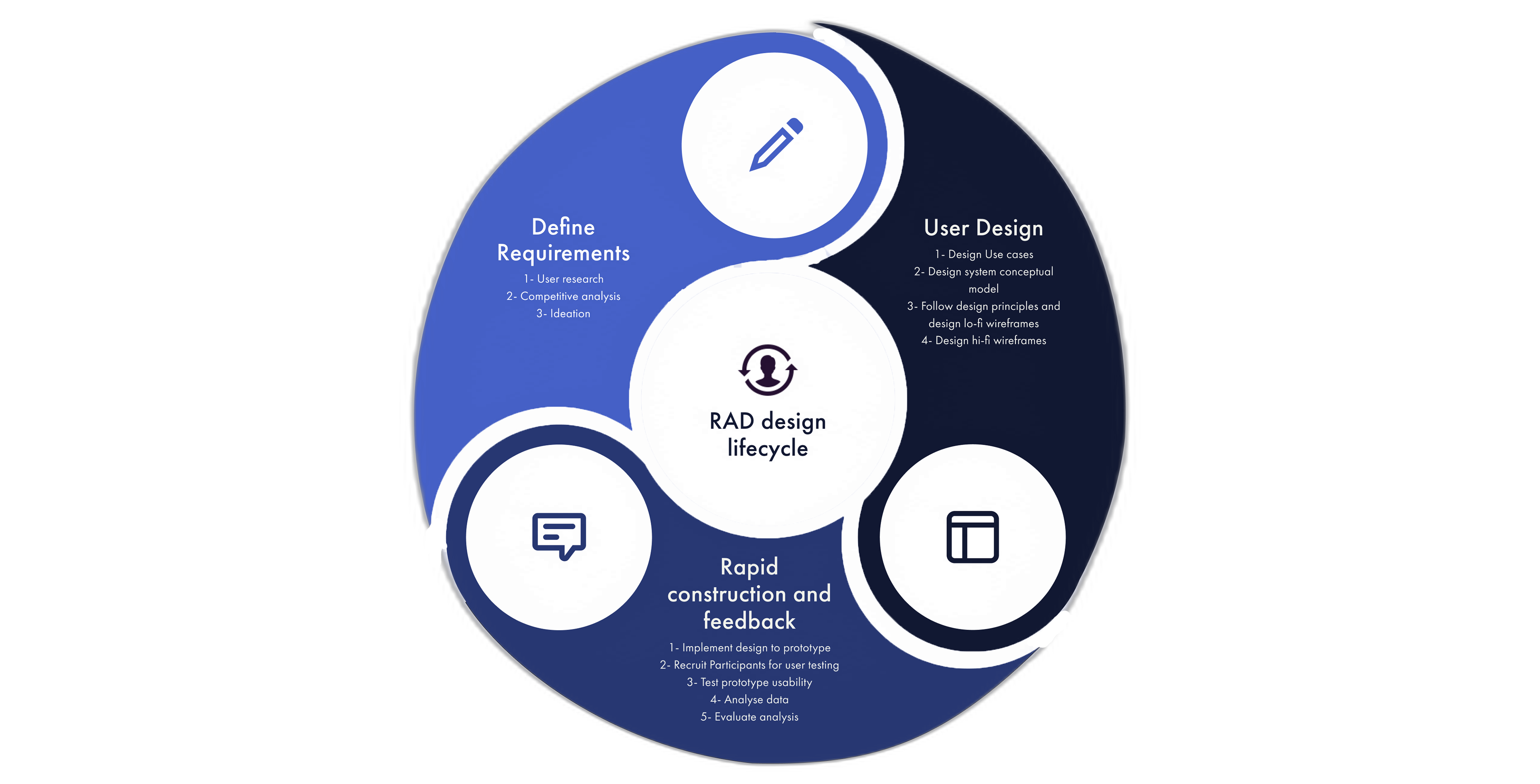
RAD design lifecycle
▪️ I managed the project with a Gantt chart to manually time-box the design tasks and adapt to any decision changes. Below is a sample of the Gantt chart.
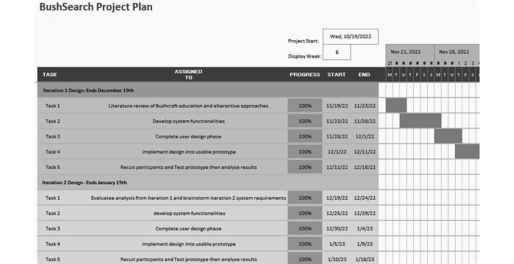
Gantt chart of the project plan
User Research
▪️ Firstly, I conducted a one-week empirical research asking family, friends and university coursemates if they knew what bushcraft skills were.
▪️ The empirical research was done to figure out what features would be helpful for users.
▪️ The results showed that no one had heard of the skill. So, I noted that one feature should teach users the fundamentals of bushcraft.

Competitive Analysis
▪️ To group the prevalence of bushcraft education in the UK, I embarked on an insightful journey evaluating the available alternative and understanding the problems they encounter.
▪️ Below is a summary of the learning alternatives with insights from each.
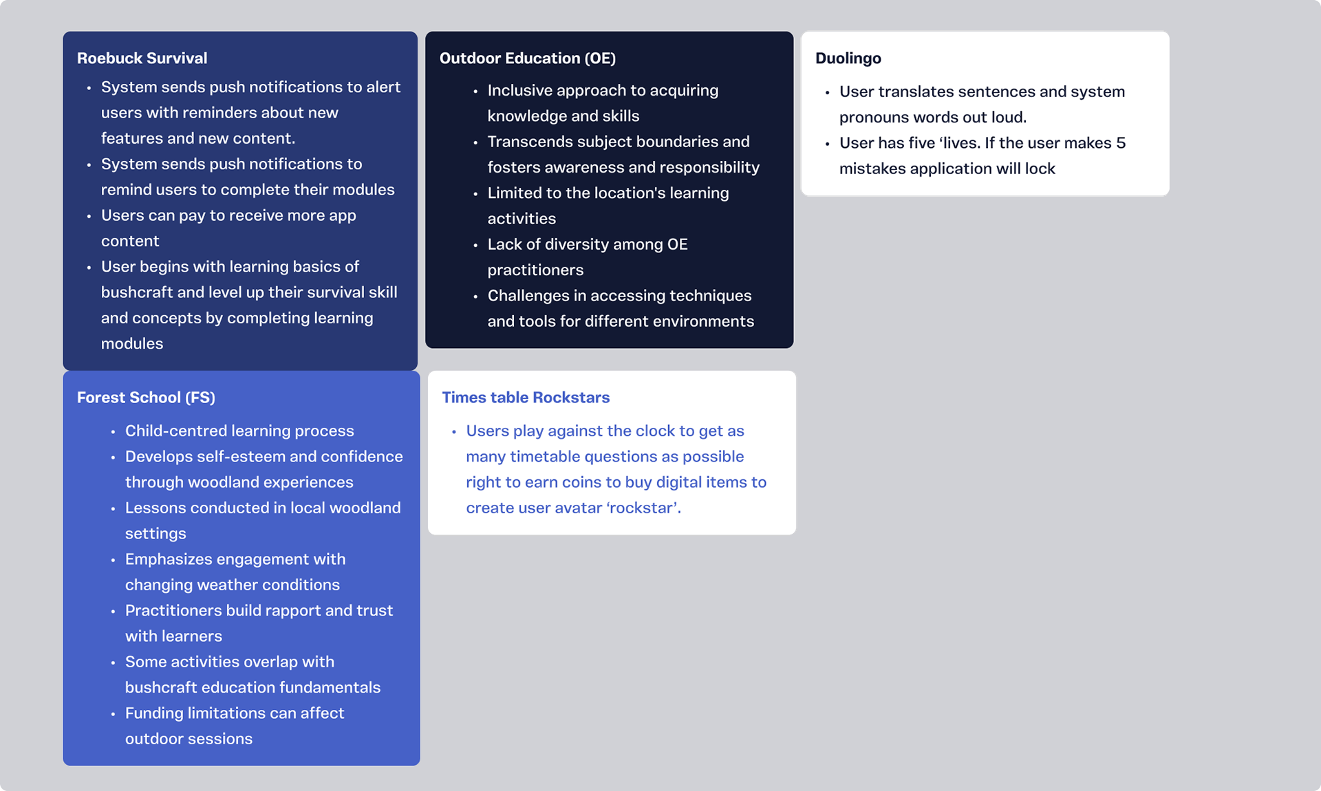
Summary of the learning alternatives with insights from each
▪️ From the analysis, I learnt there was an opportunity to include artificial intelligence (AI) features into the design as no competitor at the time of research had it available.
▪️ I created a user persona and empathy map to help me understand and define how a typical user would think and behave.
▪️ Visit pages1 & 2 of the pdf for the details :)
Ideation
▪️ I named the application BushSearch after determining concrete solutions for the uncovered problems.
▪️ I defined the functionalities for BushSearch as follows;
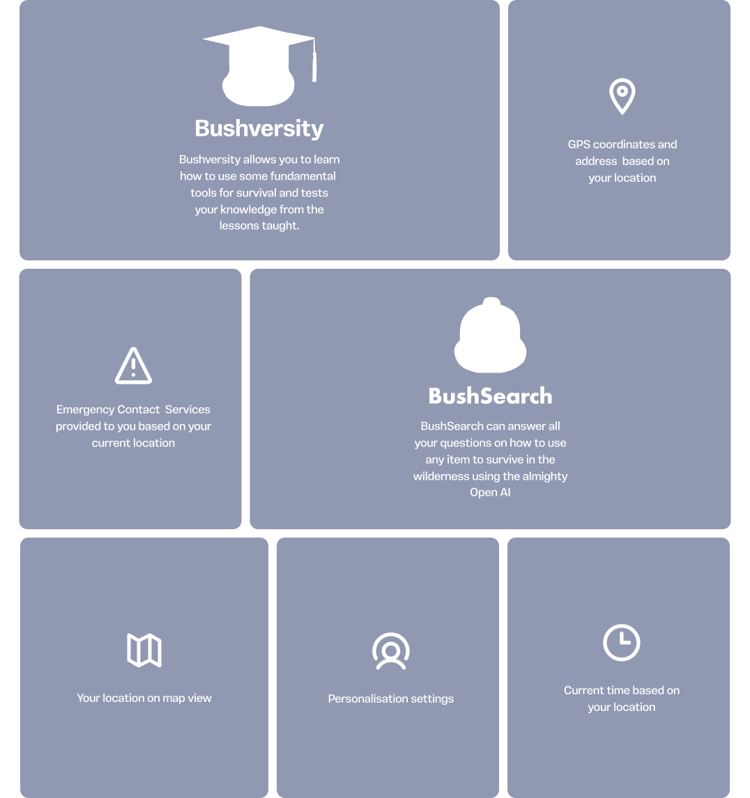
Graphic representation of BushSearch features
▪️ Visit page 3 of the pdf for an explanation of the app features :)
User Design Phase
▪️ I created two distinct iterations and prototypes for the design to provide ample options for user testing and ensure an exceptional user experience.
▪️ I designed Use case diagrams for both iterations of the system to encapsulate the interactions between the system and its users, thereby presenting a clear scope and functionality it provides.
▪️ Below is the use case diagram of the BushSearch system's final iteration
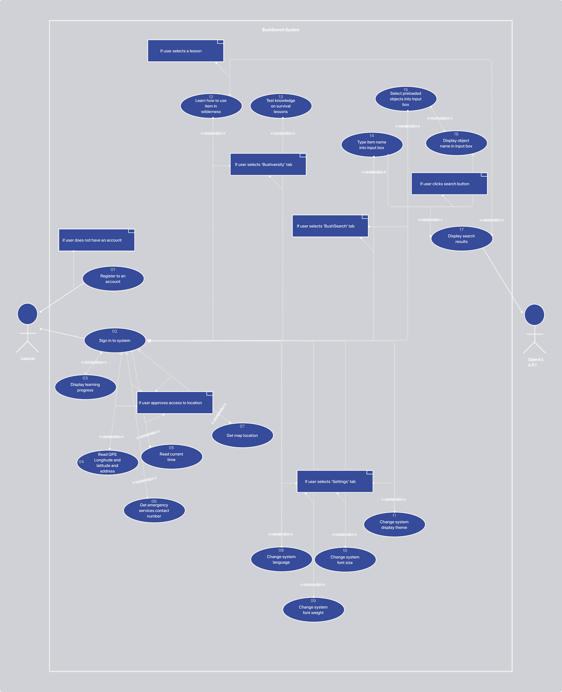
Graphic representation of the use case diagram
▪️ I followed 5 design principles while building the lo-fi and hi-fi wireframes for both iterations of the design
▪️ The principles include;
+ Conceptual modelling
+ Perceptual organisation of information
+ Error prevention and recovery
+ Flexibility-in-use
+ Simple and Intuitive
▪️ I followed these principles because they serve as a helpful guide for attaining usability in user interface design. For example, the flexibility-in-use guides the design to accommodate different people's preferences and abilities.
▪️ Below is a sample of one of the conceptual models created for the final design iteration.
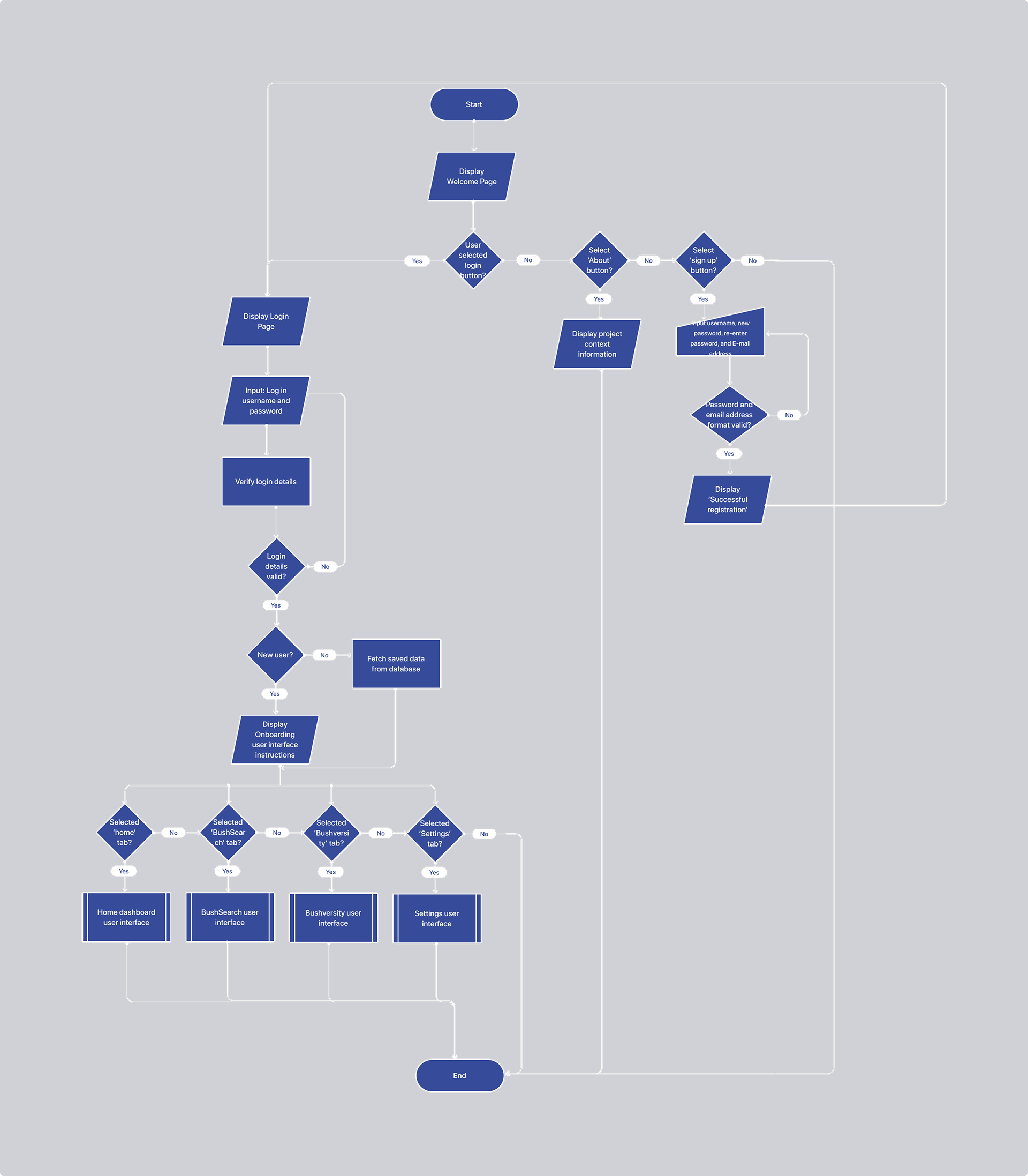
Graphic representation of the BushSearch welcome page conceptual model
▪️ Below are the UI sketches of the design's final iteration. They helped visualize how the elements would be designed for the user interface screens.
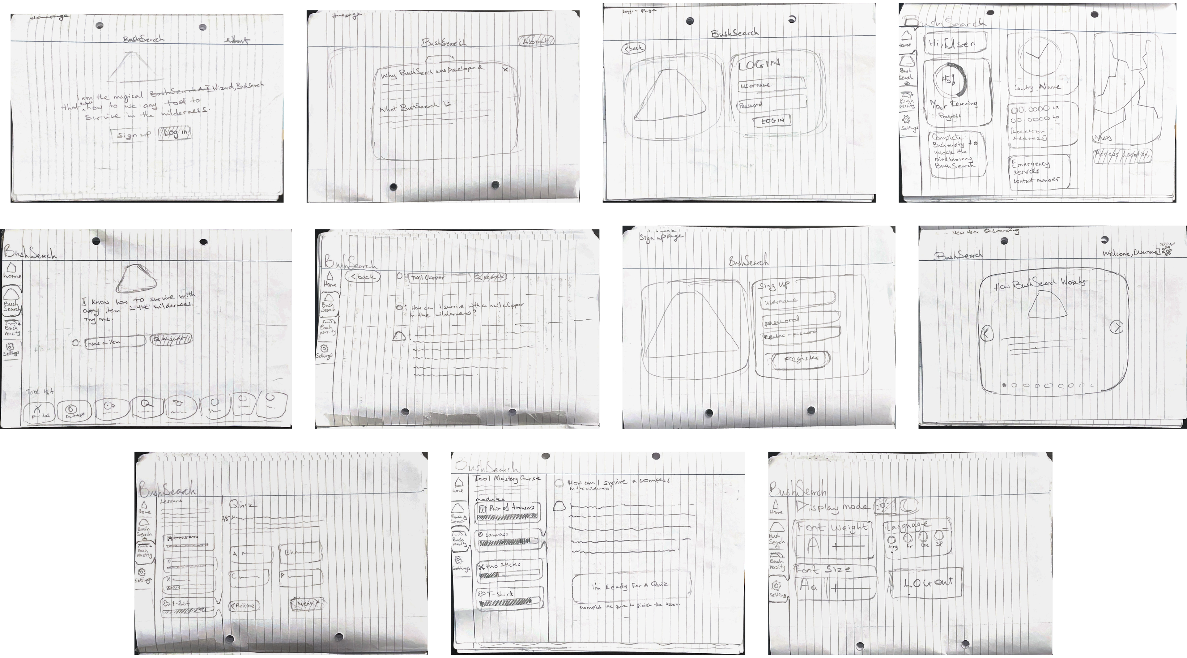
Scans of the UI sketches for BushSearch
▪️ Visit pages 4 - 23 of the pdf to view the other conceptual models and learn how I applied the design principles for both iterations.
UI Elements
▪️ The elements chosen and created for the design were to project a warm, woody and friendly feeling to the look.
▪️ Below are the basic elements used for the design
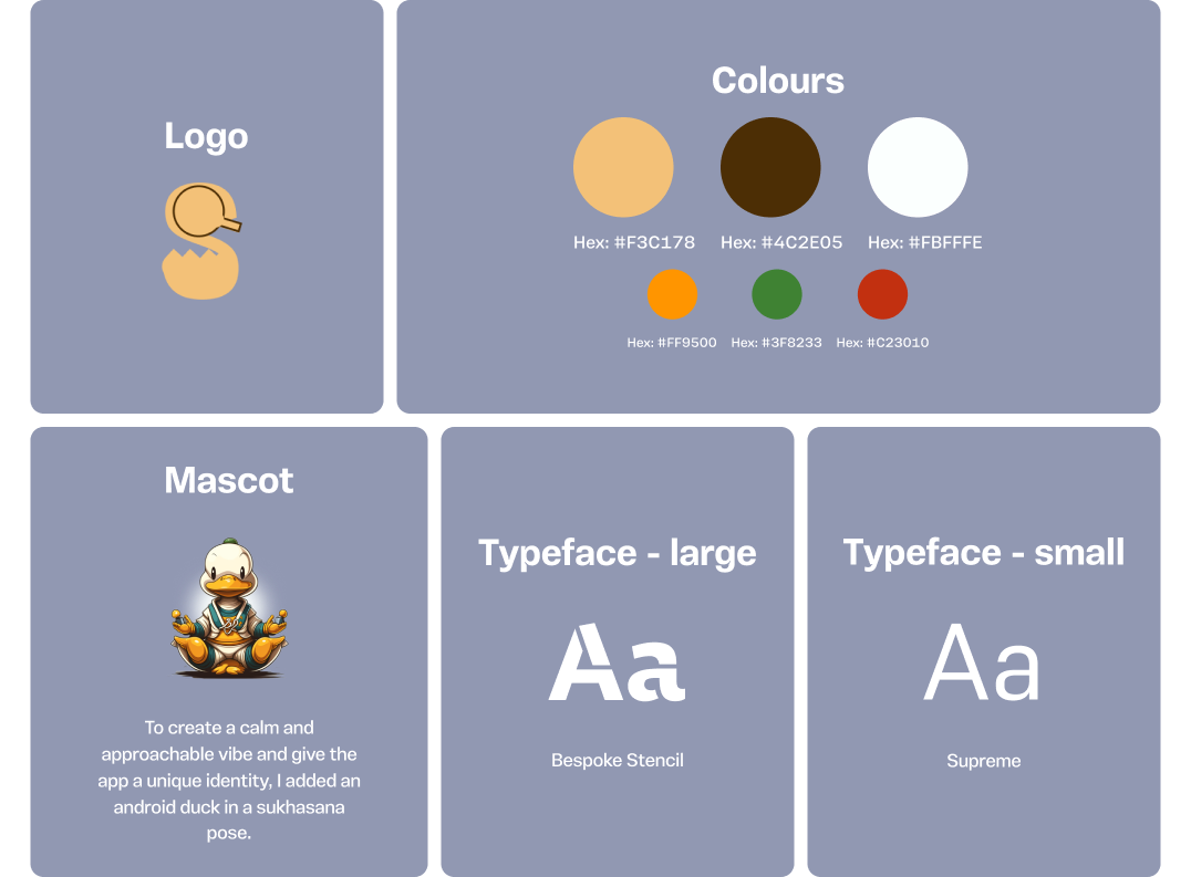
Basic UI elements of BushSearch
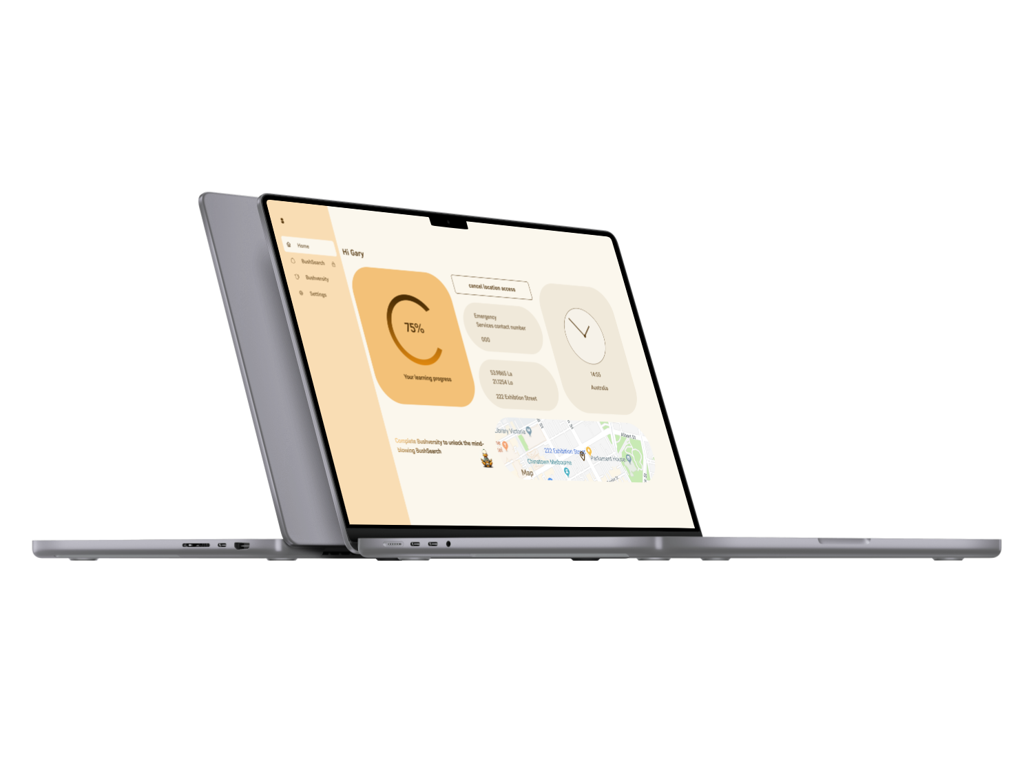
Final UI design
Rapid Construction and Feedback Phase
▪️ The prototyping of the Hi-fi wireframes allowed me to create and test potential solutions in a low-risk and iterative way.
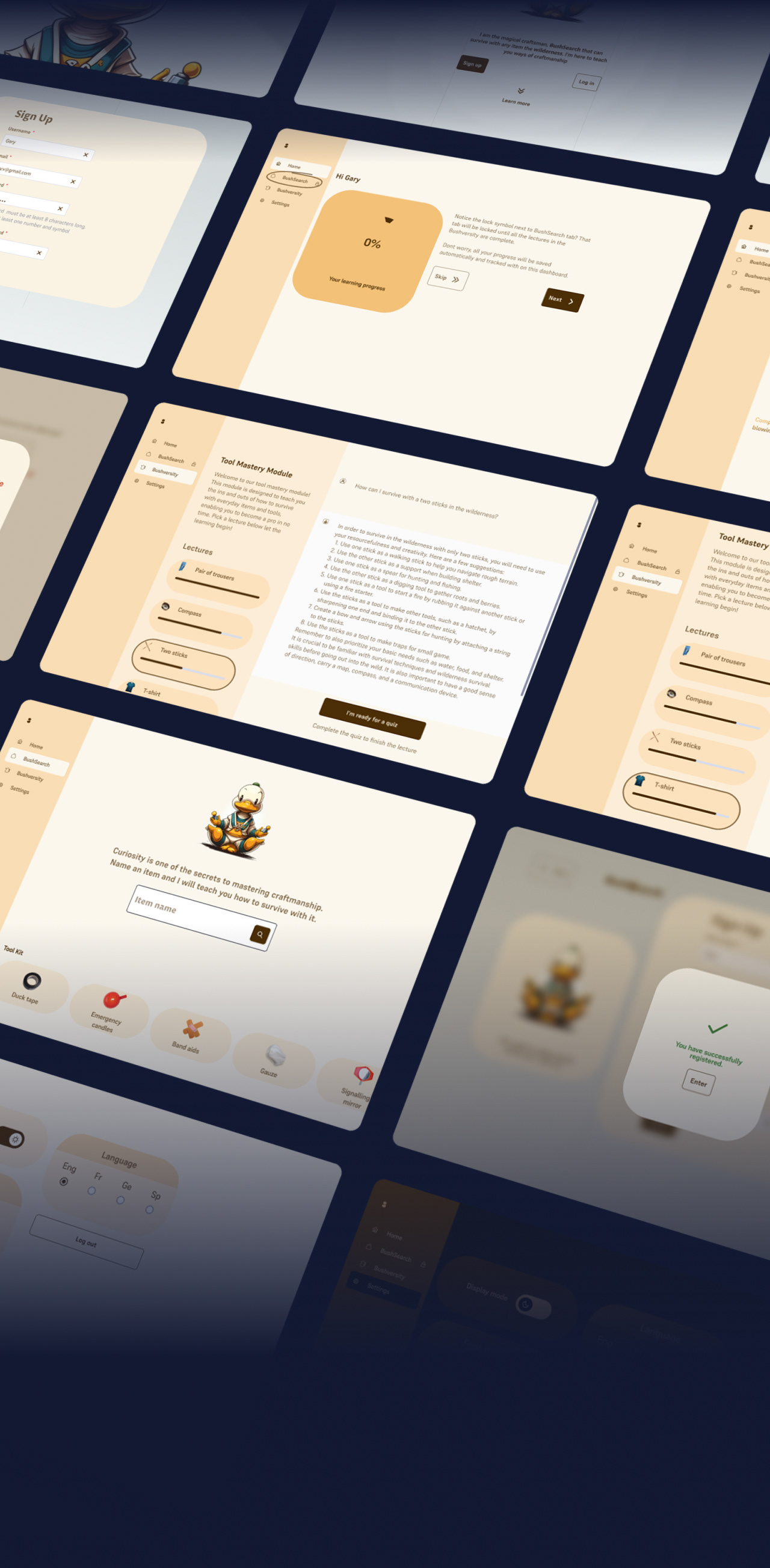
▪️ Below is the prototype of the final iteration of the design
Guidance for Software Implementation
▪️ I recommend developers follow the scrum methodology to manage the cumbersome and complex functionalities.
▪️ They develop the system using the MERN technology stack, as it significantly improves developer productivity by reducing the amount of code required to build complex web applications.
▪️ Developers can use Amazon S3 cloud storage service to store system data like quiz progress.
▪️ Developers can also use the ChatGPT API for the Bushversity and BushSearch AI search functionality.
▪️ Lastly, I recommend they test the system using white and black box testing techniques, as it can considerably enhance the quality and reliability of apps.
▪️ Visit pages 24 - 27 of the pdf for details on the guidance and recommended product backlog to follow.
Evaluation
▪️ So, after making the prototypes, I had to test how well the web app worked. To do that, I got some adults from the UK to try it out and give me feedback on how easy it was to use.
▪️ I sent requests to people within my social circle, including friends and family, to solicit their participation.
Iteration one evaluation
▪️ I recruited 13 participants with diverse backgrounds to complete the screening questionnaire to determine if they met the test requirements.
▪️ The participants received a customized usability questionnaire on Google Forms after completing the task. They were asked to answer the questionnaire while using the prototype, and the questions were related to the task.
Successes
▪️ Perceived Usefulness: A common theme found in the feedback was that the design reduced the time spent typing long queries.
▪️ Ease of Use: Participants enjoyed the system's flexibility, as well as suggestions for tool search queries and the accessibility feature of changing the system colour theme. They further emphasised the benefit of accessibility functionality in catering to colour-blind users.
Failures
▪️ Not meeting expectations: Reasons include unclear system purpose, lack of system complexity and lack of uniqueness. Some participants regarded the design solution as invalid because they could perform the same task on popular search engines such as Google and Microsoft Bing.
▪️ Mismatch of Search Results: The study showed that the system sent low-validity results to user search queries. During the session, one participant noticed that some results did not match the tool query name.
▪️ Another negative feedback was the lack of uniqueness. The study found that most participants did not notice the system's authenticity.
Final iteration Evaluation
▪️ In iteration one, only 45.5% of participants engaged with the usability study after screening the questionnaire.
▪️ To ensure better results, I made some changes to iteration two. I decided to use purposive sampling instead of a screening questionnaire to recruit nine participants that fit the target audience requirements. This change in strategy was successful and I was able to recruit all nine participants for the study.
▪️ The usability study was provided using the Maze usability testing platform for the heatmap, click rate and bounce rate data.
▪️ The analysis was done by conducting data interpretation and thematic analysis based on the study goals.
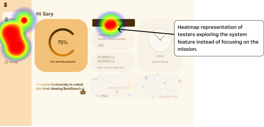
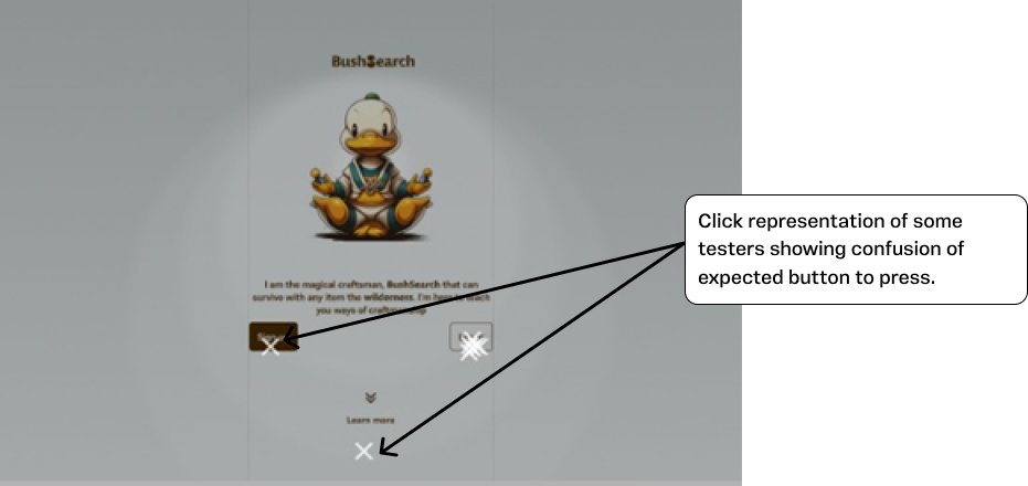
Study goal 1: Understanding how users interact with the system
▪️ I created walk-through mission-based tasks to measure study goal 1.
▪️ It resulted in a maze usability score of 73 out of 100.
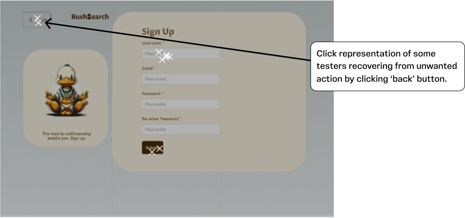
▪️ Participants could recover from unwanted actions, as shown in the clicks on the screen below.
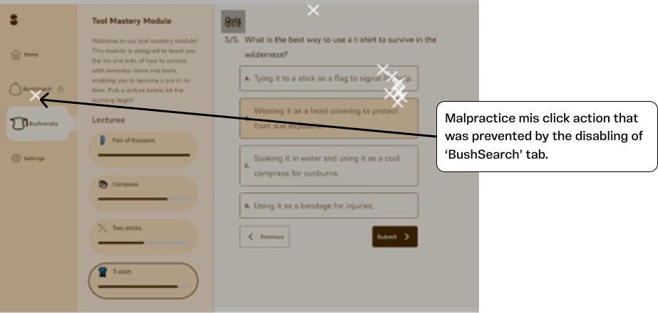
▪️ Misclicking action was prevented by disabling the 'BushSearch' tab. As shown on the screen below.
▪️ However, the data showed that participants were distracted by other system features, and the system may have lacked clear indicators.
▪️ The login button was not easily readable by the participants as there were some misclicks on the screen below that showed the login task.
Study goal 2: Evaluating if the system aids informal learning of bushcraft
Successes
▪️ Ease of use: Participants in the study consistently praised the system's user interface design, highlighting its clarity, instructiveness, and easy navigation.
▪️ Perceived usefulness: Participants in the study expressed positive feedback about the prototype, highlighting its benefits in terms of guiding their learning, consolidating knowledge, providing authentic responses, and encouraging creative thinking.
▪️ The use of the GPT model in BushSearch provides immediate and authentic responses, enhancing the user experience.
Failures
▪️ Unclear indicators: The theme indicates the user interface learning process requires more indicators to identify elements, such as incomplete lectures and quizzes.
▪️ Unwanted quiz restart wait time: The theme code showed that most participants thought the wait time for a failed lecture quiz to restart was 5 minutes.
▪️ Heavy Computing Performance: The theme showed that the user interface prototype required heavy-performing computers because of the animations and micro-interactions of the elements.
Reflections
▪️ The final design met the project goal by ensuring the system was free for users to learn bushcraft fundamentals.
▪️ The evaluation of the final prototype showed it aided informal bushcraft learning as participants found the learning process to be an effective guide, the sample quizzes reinforced their knowledge, and the AI search feature encouraged creative thinking.
▪️ However, the design solution requires an internet connection and a laptop-sized screen, which may be inconvenient for users.
▪️ I wish I knew if a design solution for smart mobile devices was more convenient than laptop devices.
▪️ Also, it'd be cool to see how kids use the system in a controlled environment (like a classroom) versus an uncontrolled and unmoderated environment (like libraries).


